
Brand & creative / Concept study 01
A bolder brand direction.
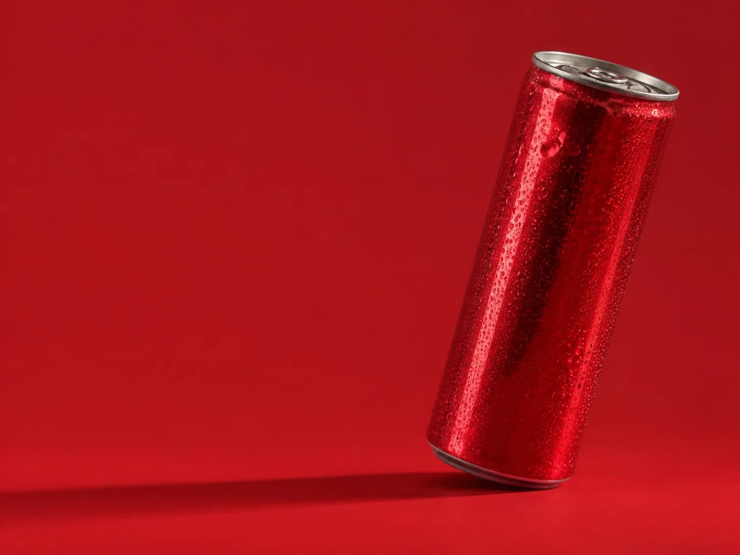
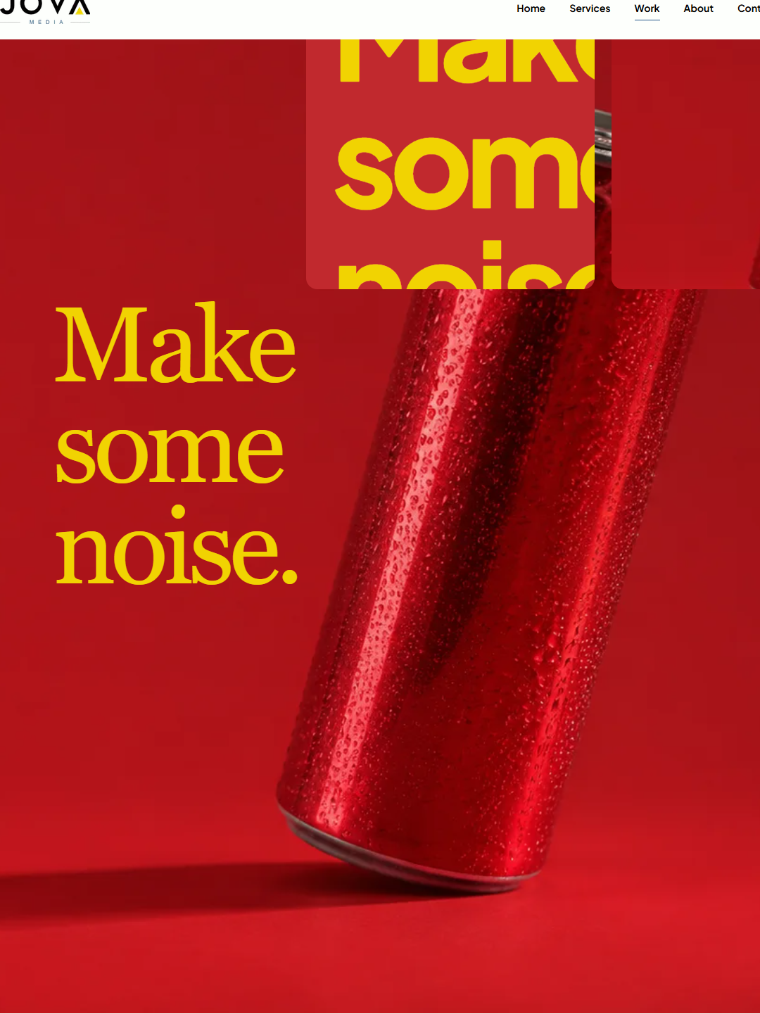
How do you make an unfamiliar product feel immediately recognisable? A focused colour palette, oversized type and expressive product imagery give this fictional drinks launch a clear voice.
some
noise.
01 / The creative brief
Starting with one idea.
Make a fictional sparkling drink easy to notice and easy to recognise across a campaign poster, social formats and a simple landing page. “Make some noise” is an invitation to show personality.
Audience assumption
Adults interested in design, culture and discovering independent brands. This is a design assumption, not a research finding.
Communication goal
Create a memorable first impression through one message and a consistent focal point across different formats.
Constraints
An unbranded fictional can. No ingredient, health, sales or audience-response claims. No working purchase flow.
02 / Art direction
Building a visual language.
Colour that carries the idea.
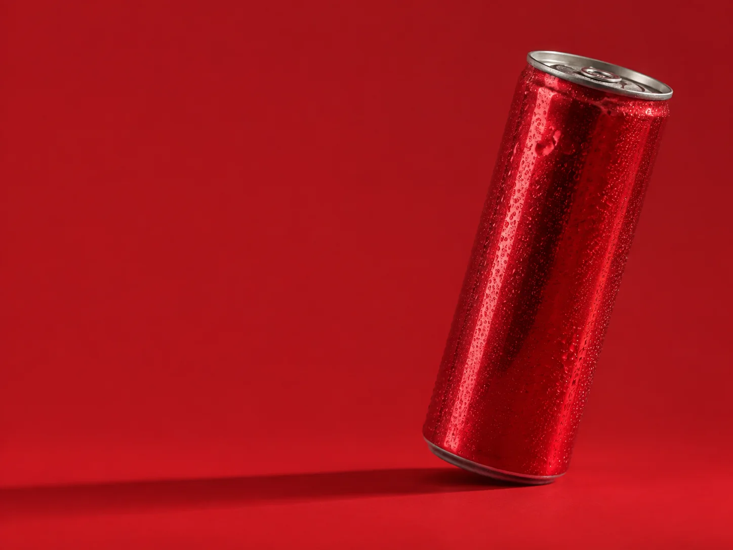
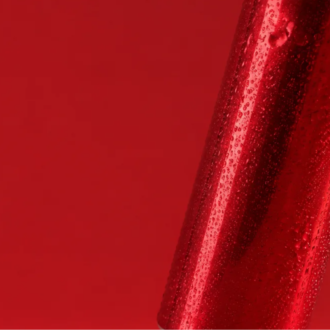
Red creates the signature. Gold gives the headline contrast. Porcelain makes room for supporting information. The product crop stays close enough to show the tactile condensation.
#C1292E
#F1D302
#FDFFFC
A short message, confidently set.
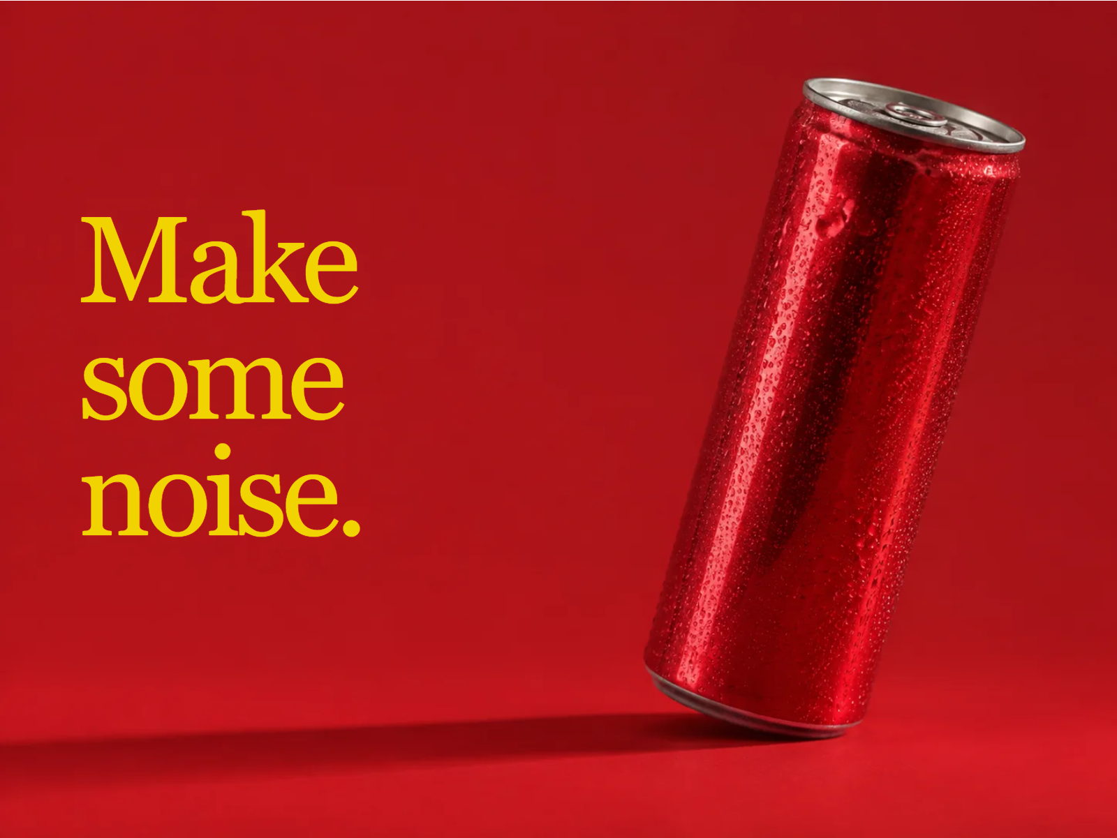
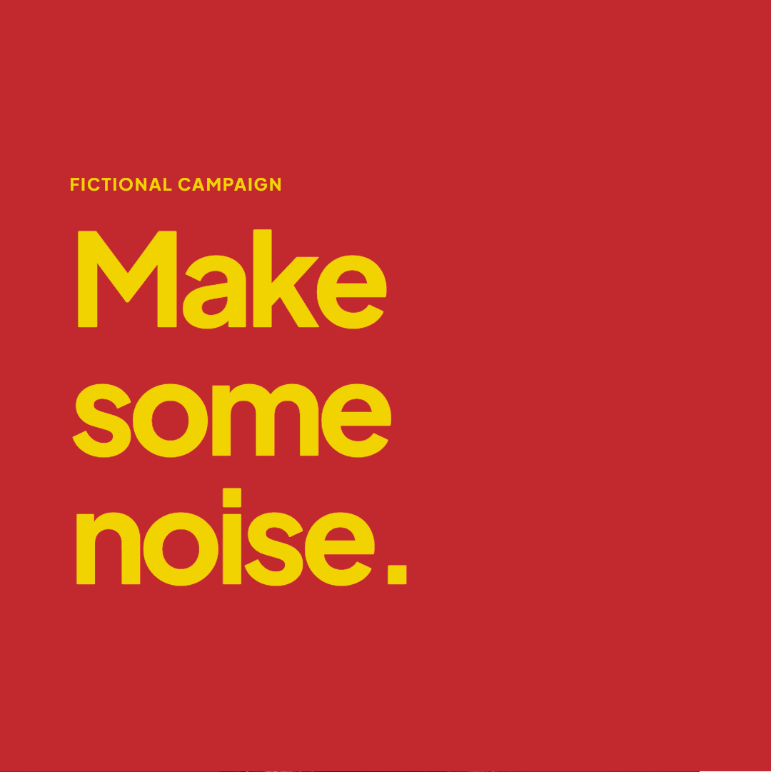
Large editorial serif lettering is used as campaign artwork, with Plus Jakarta Sans for supporting interface copy. The headline occupies the left side; the product gives the composition its weight on the right.
The imagery is AI-generated for this fictional creative exercise. The layouts, adaptations and responsive prototype are implemented as part of this study.
03 / Format adaptations
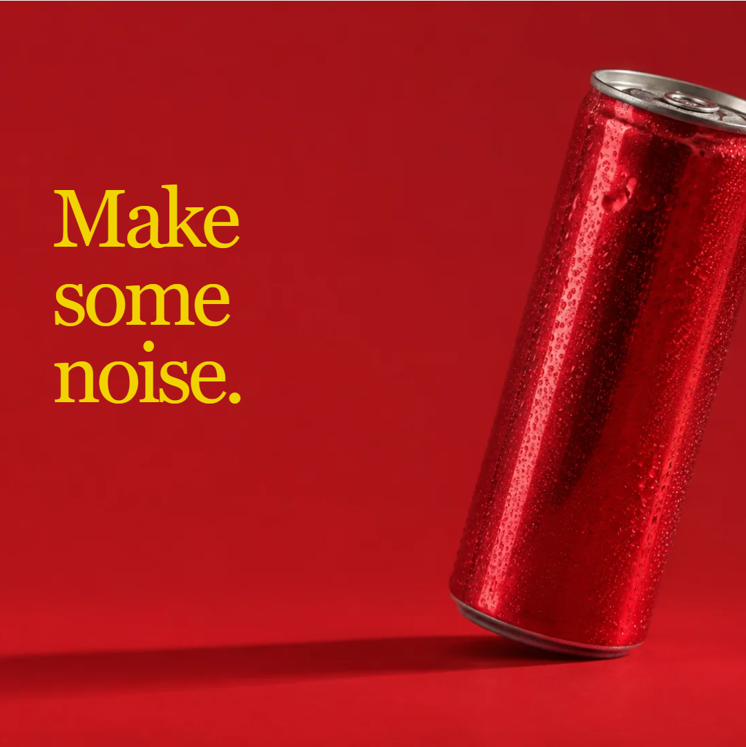
One idea. Different spaces.
some
noise.
04 / The layout exploration
Two routes, one decision.
SOME
NOISE.TYPE FIRST / OPTION A
some
noise.
05 / Responsive expression
From the poster to the screen.
The landing concept brings the same art direction into a responsive layout. Its discovery action opens a product-story section; it does not offer a checkout for a nonexistent product.
Open the working concept